To review AI product imagery, look at the product details, the scene and the full image set. If you are choosing images for your brand, a close review helps you decide whether the work shows what you intend.
An image can have lovely light and still need changes. Give the product itself a careful look before you approve the whole scene.
Keep a clear product reference beside the image
For an image of a real product, compare the result with clear views of that exact item. Check its outline, size, color and surface. Adobe’s product photography guide also stresses accurate product details. Look at each visible part, including handles, lids, seams or fasteners where they apply.
Read any visible words. Adobe’s notes on Firefly’s known limits note that generated text can be distorted or unclear. That is one reason to review each word closely. Check spelling, logos and packaging details against the approved brand files. If a detail is too small or unclear to judge, flag it for a closer review.
These checks matter even when the setting is meant to be imagined. Decide which parts of the scene can change and which product details must stay exact.
Check what the scene suggests
Nearby objects help tell the viewer what they are seeing. Check whether those objects belong in the scene and whether they suggest something true about the product.
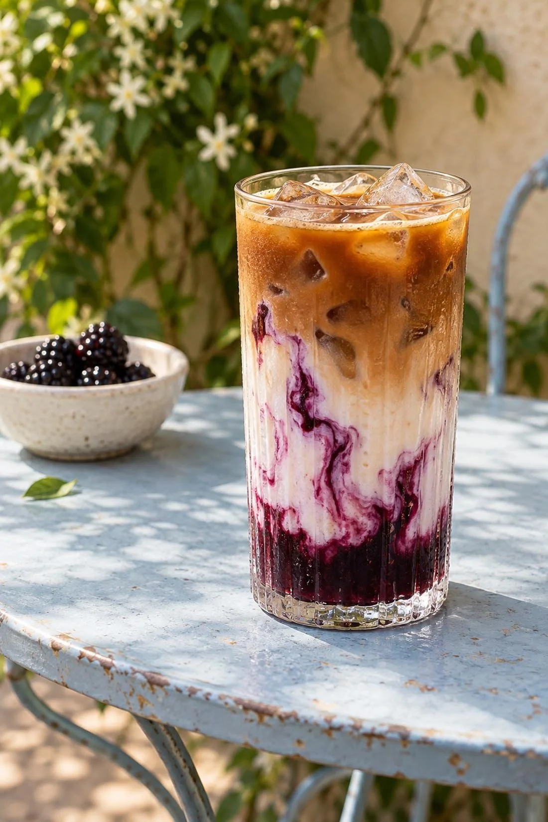
For food or drink, a visible ingredient can carry meaning. A bowl of berries beside a glass might suggest a flavor. Confirm that such a detail fits the actual product before you use the image to sell it.
The coffee studies in my selected work are self-initiated work. They are examples of styled scenes, with no claim about a named product, recipe or client.
Follow the light and the edges
Look around the subject at full size. Check the points where glass meets a surface, where a hand touches an object, or where packaging overlaps another item.
Then look at the light. Do the shadows fit the scene? Are important details visible? Does a reflection hide a label or change how the shape reads?
For a close view of a product, small details may be part of the reason someone stops to look. Give those areas the same care as the overall mood.
View the images together
Place the proposed images beside each other. Compare the product color, shape and scale across the set. Check that any changes in angle or distance make sense.
The setting can vary while the direction stays clear. In the coffee studies, different surfaces and light give each scene its own mood. For a real product campaign, the product reference would remain part of the review across every scene.
AI art direction for brands explains how those shared visual choices fit together.
Check the final crop
View the image in its planned layout before you approve it. A tight crop can cut off part of a package or remove space needed for text. Check a phone view as well as a larger screen.
Record changes in clear terms. “The label text needs to match the supplied file” gives a more useful next step than “something feels off.” Keep the reference and the image together while you review each change.
To see more image directions, explore my selected work. To talk through imagery for your own brand, start a conversation.