AI art direction for brands shapes the idea and visual choices behind a set of images. If you are planning imagery for your brand, it helps to know what should connect those images before you choose a favorite.
A portrait, a close-up and a wide scene can each look different. Shared choices about light, color and shape can still make them feel at home together.
What does AI art direction include?
Art direction gives the work a clear visual point of view. That can include the setting, styling, light and place of the subject in the frame. AI is part of how the image takes form. Human choices shape what belongs in it.
For a brand, those choices need a purpose. A product might need to stand out in a quiet scene. A campaign might call for a more imagined world. A service might need images that express a feeling without showing a product at all.
The starting question is what you want someone to notice or understand when they see the work.
I bring a photographer’s eye to AI imagery. I shape each image through light, composition and styling.
Give the idea visible details
Words such as “warm” or “modern” leave room for many readings. A visual direction becomes clearer when those words connect to details you can see.
Warm might mean soft side light, cream-colored surfaces and a close view. Modern might mean an open frame, strong shapes and space around the subject. These are possible choices, rather than fixed rules for either word.
It also helps to name what needs to stay true to the brand. That might be a product color, a shape or a certain balance of stillness and movement.
Look at how the parts connect
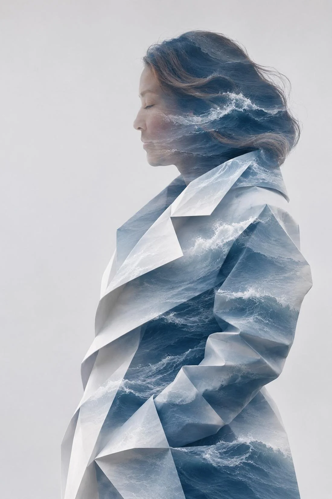
In Paper Tide, pale paper folds and blue waves run through a portrait. The plain background leaves space around the portrait. The space around a subject has a role in the image too. Fujifilm’s guide to negative space explores that part of composition. The cool colors and repeating folds link the parts of the image.
The coffee studies use a different kind of scene. A blue table, a green counter and a window seat each give the drink a setting. Light, surfaces and nearby objects change the mood around the glass.
These are self-initiated studies. They show visual ideas, without claiming a client campaign or a real location.
Review the set as well as each image
When you look at a group of images, ask what holds them together. Does the light feel related? Do the colors sit well beside each other? Is the subject clear in each frame? Adobe’s guide to symmetry and balance offers a closer look at how subjects and space can balance a frame.
Some variety gives a set room to breathe. A closer view can draw attention to a detail. A wider view can show more of the setting. The shared direction gives those changes a reason.
For work that shows a real product, a separate review of its details matters too. The guide to reviewing AI product imagery covers that step.
Bring your product or service into the conversation
To explore a direction for your brand, start a conversation. You can share your product or service, a link to your brand, or a deadline if you have one.